Tuesday, 30 October 2012

Screw bind

Nikolaus Schmidt Design — Graphic Design / Art Direction / Branding / Corporate Design / Websites
Nikolaus Schmidt Design 
A really nice book-bind using screws an board as the cover. I lan on doing something similar for my prolifera tech biref

Screw Bind

Hanna Ter Meulen | USEFUL

This is a beautiful looking screw bind. They have actually made a sleeve like cover which looks really nice. Simple and elegant

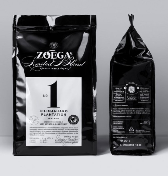
Coffee packaging


Designed by DDB Stockholm | Country: Sweden

Some really attractiv coffee packaging here. You can almost smell the coffee from here. I really like this design the contrast of the black and white really helps it come alive
“Zoégas is a Swedish coffee company founded in the 1800s, that specialises in dark roasted coffee.
Limited Blend No. 1 from Tanzania is the first edition of a limited series roasted whole beans from around the world. The design is created to stand out among competitors, generate interest as a limited edition premium series, and enhance Zoégas position as the best in knowledge and development of new blends and compositions.”

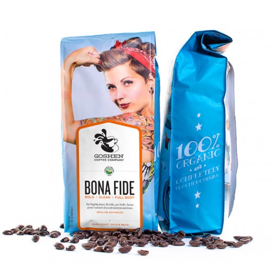
Coffee Packaging


Designed by Atomicdust | Country: United States

Is different to most ofther coffee packets out at the moment and i feel they have there selected target audience. not my style but nice never the less
“Our goal with the packaging design for Goshen Coffee was twofold – we wanted to create a distinct look that represented our client’s uncompromising attitude, while simultaneously looking nothing like other coffee brands on display in the local St. Louis market. The labels are actually stickers that are affixed when the bags are filled.”

Stationary

A cracking set of stationary here. love the colour of the stock and screw used are a beautiful colour.


A cracking

Business cards


Designed by Gardens&Co. | Country: Hong Kong
“Nana Chan, a self-styled epicurean, commissioned us to create an identity for her self-projects: blog, Youtube channel and tea house in Taipei (Coming soon!). From a Lawyer turned to gourmand and travel junkie, she believes the simpler things in life that matter most. We like it so much and, in fact, it is our belief too. We based on her personality and writing, a pure and quiet visual language was created to convey her message. We take “- – - – -“ to portray the repeating pattern of our living and Nana shares the little surprises to our lives “- n – a – n – a – “. We adapted this system throughout all projects and applications. All photos were taken by Nana.

Beautiful Stationary


designed by Dawson Beggs | Country: United States

Really good set of stationary here. it is all foil blocked and all the colours work really well together

“Identity work for a fictitious upscale San Francisco hotel inspired by the San Francisco gold rush. The logo was inspired by the sails of a ship and the golden gate bridge, as well, the name “Argonaut” is a reflection of what gold seekers were once known as.”

Coffee Branding


Monday, 22 October 2012

Seb Lester

These are some examples of Seb Lester's work in


Dreams – Limited Edition Print – Available in two colourways'Blazing' - Limited edition print - available in gold & silverBelieveIndelicate

Carolyn Sewell

Carolyn Sewell is a graphic designer who specializes in hand rendered type. Among the paid work she does there is a great deal of personal projects such as the post card set she sends to her parents every week. 
I admire the huge range of style and skill she has in the field. Although not the style i tend to look at i have found it really useful to see the different ways letters can flow together. 
I wish i had more time to draw experimentally to get my skill in this field up but im not sure if i would like to pursue it as one of my main skills in graphic design. 


Tuesday, 16 October 2012

Skullduggery Clothing

Not the biggest fan of this clothing company but i feel like they have a big enough range for a small company for me to talk about them. They have a large range of vest, tee's, jumpers and even jewellery. 
The majority of the designs are really simple and minimal and they use a lot of tie-die.
I don't even think they have a logo but maybe this is what they intended in the day of all this vintage unbranded clothing appearing.
Also the photographing of the products is extremely varied each photo is using a different hanger and the background colour is changing constantly.
I personally don't like this stuff but i think they know their target market and thats who would appreciate this work. 


Full Beam Clothing

Full Beam Clothing is a relatively small company who hasn't got many designs but applies their designs to a range of clothing and colours. They have a nice died t-shirt which i wouldn't mind experimenting with. 


Tuesday, 9 October 2012

Merch Asylum


I was put into contact to this T-shirt supplier and printers buy the clothing company X C V B. They are based in Cardiff and specialize in screen printing. They have many clients who they print for but they also do things like re-labeling, supply clothing, heat-press.

I will be in emailing Merch to enquire about their t-shirt stock and potentially other clothing items such as Jumpers and hoodies.

Who? Clothing Biggie sweats, only available at whoclothing.com #merchasylum #screenprint #screenprinting #print #printing #printlife #cardiff #uk #london #biggie #big #who #whoclothing  (Taken with Instagram at Merch Asylum - Screenprinting Studio)

XXYYXX #merchasylum #uk #cardiff #southwales #screenprint #screenprinting #print #printing #printlife #pontyclun #london #xxyyxx #merch #electronic #electronica #soundcloud #embroidery #tshirt #heatpress  (Taken with Instagram at Merch Asylum - Screenprinting Studio)

Monday, 8 October 2012

Other Styles of Illustrative Type


This one below is a loverly piece of type i love the way the shading lines make it look 3D. The capitals work really well together and create a nice focus for the logo. 

This one again uses 


Handwritten Type

These are two very attractive pieces of illustrative typography. I think these are the closest representation of design that i am thinking for Loose clothing logo. 


This piece that says focus flows very well i especially like the s' at the end. 


I really like this series of letters they flow nicely and the X hight varies with each letter which makes it seem more hand rendered.

Design for Science

When researching i came across this website Design for Science who's focus is on the visual communication of science. 


Phyllotaxis

After looking into the pattern s of planst eddie let me know there is a name for this Phyllotaxis is the arrangement of leaves on a plants stem. I have been looking further into it and there are many different forms you can make and there is a mathematical t.heory behind it.
I really want to give these a go and see what i can come up with


Natural Patterns

I have found some more natural patterns mainly concentrating on the spiral form.
My next step is to start drawing some of these and seeing what results i can come up with.
Might not be the right path to go down but i am really intrigued by the idea.

Spiral Pattern in Pine Cone - ID: 2215318 © Kevin  Kopchynski

Sunflower Double Spiral Pattern - ID: 1990407 © Kevin  Kopchynski

Burst Pattern in Carrion Flower - ID: 2215169 © Kevin  Kopchynski

Radiating Leaf Pattern - ID: 2215316 © Kevin  Kopchynski

http://www.kevinkopchynskiphotos.com/-/kevinkopchynskiphotos/gallery.asp?LID=&cat=66949&pID=17&row=15&photoID=1930794

Patterns in Nature

For the Vitro Regeneration project i had an idea for the logo where i used pattern created by plants to make the symbol for the logo.
I will look into this further and find some more patterns but i feel this would make a nice edition to a logo.
I sway more to the spiral pattern as it would make a nice vectored image.


Photo: Hibiscus flower petals

Photo: Palm fronds

Photo: The veins on a castor bean leaf

http://photography.nationalgeographic.com/photography/photos/patterns-flora/#/prickly-pear-cactus_9380_600x450.jpg