Wednesday, 12 December 2012

Good cafe website


I found this really attractive website for a cafe called Morgan St Cafe. i love the use of a wooded side bar and use of photography for each page works really well. A very minimal design throughout which showcases the content really well. 


Coffee Photography


Really like this uses of coffee and think it is a really good photograph.  The image created is an owl and the coffee is photographed and set up really nicely. Would make a good image for on packaging or website. 

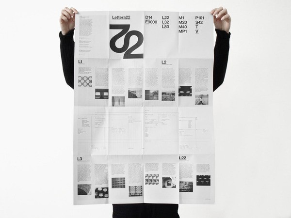
Interesting Folds

Here is a nice fold out document which is something like what i want to produce for my It's nice that brief. I like the simple layout and keeping it really structured.

2 Colour Print

Found this really nice book which is the style i am trying to go for on my new It's Nice That brief where i use a 2 colour print images one colour and text another. I really like this book think its a little stunner.

Coffee type

some nice hand drawn typography spelling the word coffee

Coffee Poster

Really attractive 2 colour poster advertising a coffee shop. Really simple and effective poster. Useful research for both coffee project and Soft porn. 

Interesting folds

Here is a piece that uses different folds effectively. The triangular pattern help explain the fold. Good piece of design

Simple Layout

A great pice of minimal design layout here. Not really doing anything similar at the moment but for some reason i was just drawn to it. Lovely work and really good use of white space and type used.

Coffee packaging

design work life » Pedale Design: Quills Coffee

This is a similar idea i was going for where by all the packaging is the same and it get altered by what is in the bag. Simple and effective. Lovely simple design

Coffee Packaging colours


SOme nice colours used here they are very similar to the ones i have chosen. Maybe i just have a good eye for coffee or maybe they have seen my amazing colour choice.

Con

Coffee

Some really attractive stationary produced for this coffee brand Jacu. Everything looks really good they have also utilised embossing machine and also rubber stamps. Some really nice work here. 


Tuesday, 30 October 2012

Screw bind

Nikolaus Schmidt Design — Graphic Design / Art Direction / Branding / Corporate Design / Websites
Nikolaus Schmidt Design 
A really nice book-bind using screws an board as the cover. I lan on doing something similar for my prolifera tech biref

Screw Bind

Hanna Ter Meulen | USEFUL

This is a beautiful looking screw bind. They have actually made a sleeve like cover which looks really nice. Simple and elegant

Coffee packaging


Designed by DDB Stockholm | Country: Sweden

Some really attractiv coffee packaging here. You can almost smell the coffee from here. I really like this design the contrast of the black and white really helps it come alive
“Zoégas is a Swedish coffee company founded in the 1800s, that specialises in dark roasted coffee.
Limited Blend No. 1 from Tanzania is the first edition of a limited series roasted whole beans from around the world. The design is created to stand out among competitors, generate interest as a limited edition premium series, and enhance Zoégas position as the best in knowledge and development of new blends and compositions.”

Coffee Packaging


Designed by Atomicdust | Country: United States

Is different to most ofther coffee packets out at the moment and i feel they have there selected target audience. not my style but nice never the less
“Our goal with the packaging design for Goshen Coffee was twofold – we wanted to create a distinct look that represented our client’s uncompromising attitude, while simultaneously looking nothing like other coffee brands on display in the local St. Louis market. The labels are actually stickers that are affixed when the bags are filled.”

Stationary

A cracking set of stationary here. love the colour of the stock and screw used are a beautiful colour.


A cracking