Monday, 31 October 2011


  • Packaging design for the complete line of products Suavipiel. The aim was to get a line of bath products differentiated from other brands, with a low production cost. The choice was a purely typographic design, clean and clear, which uses the name of different families as a main chart.
  • Diseño de packaging para la línea completa de productos Suavipiel. El objetivo era conseguir una línea de productos para baño diferenciada de otras marcas, con un coste de producción bajo. Se optó por un diseño exclusivamente tipográfico y claro, en el que se utiliza el nombre de las diferentes familias como elemento gráfico principal. 
HEYDAYSHEYDAYS
Heydays
Our very own profile. Only one typeface is used in limited sizes. The shiny chrome is an interpretation of our name — Heydays. The use of cardboard is in contrast to this, it is for function and everyday use. The use of function is further elaborated in the heavy use of custom tape. Print finishing includes blind emboss, mirrorboard, cardboard and silkscreened jewelcases.

Stock Options and Printing Methods

Spin × Design Museum   High res SpecialSpin × Design Museum   High res SpecialSpin × Design Museum   High res SpecialSpin × Design Museum   High res Special


A poster series which have all been Silk-screened. the Overprinting of the colours give an attractive blend of colours which work well together and with the grey stock. They are aimed for a design related audience and they definitely appeal to them. 

Stock Option and Printing Methods

MAINSTUDIO   High res SpecialMAINSTUDIO   High res Special

Some very nice and simple Identity prints here. Using black foil on black stock looks next level fresh. simple and attractive design i hope to use this technique in the future. but for my current project i don't think black on black would be the way to go.

Stock options and printing methods

MAINSTUDIO   High res SpecialMAINSTUDIO   High res Special

Here are some very attractive prints designed for Cream PR. the printing method used is foil blocking which is has given a slight de-boss. The stock used is a nice thick off white which brings out the bright foiling very nicely. i really like this and the foils are to in your face like i am used to seeing the matte colours almost look screen printed.

Stock Option and Printing Methods.

Morse Studio   New Website, New WorkMorse Studio   New Website, New WorkMorse Studio   New Website, New Work

Simple and affective packaging range and brand identity fot kitchen company "Falcon". the whole range screams Traditional retro which suits the products very well. A birds eye view of the product as a boarder on the top of the box. the printing methods looks as though it has been screen printed due to the matte and crisp white effect.

Design For Print Stock Considerations

The Luxury of Protest   New PosterThe Luxury of Protest   New PosterThe Luxury of Protest   New PosterThe Luxury of Protest   New Poster

A stunning piece of design here which has been C-typed print for the info graph in the centre while the rest is screen printed in a matte white, the whole thing is done on Fujiflex pastic. Never really seen anything like this and is a nice piece of innotative print. It is a graph o show empires, colonies and also territorial occupations from the year 2334 BCE to the present.

Printing methods

Proud Creative   SI SpecialProud Creative   SI SpecialProud Creative   SI Special

Proud Creative Volume 2
A beautiful publication which has been litho printed and singer sewn together. i really like the binding method and is similar to the Japanese bind i am familiar to. i plan to apply these style of binding to my catalog if i end up producing it for my current project.

Proud Creative   SI SpecialProud Creative   SI Special

Here is just a nice example of way finding where they have uses a series of different coloured tape. they have applied this design onto other products such as bags, t-shirts, flyers etc. not particularly my style but good design at that.

Sunday, 16 October 2011

The Printing method for the Cover of Novum

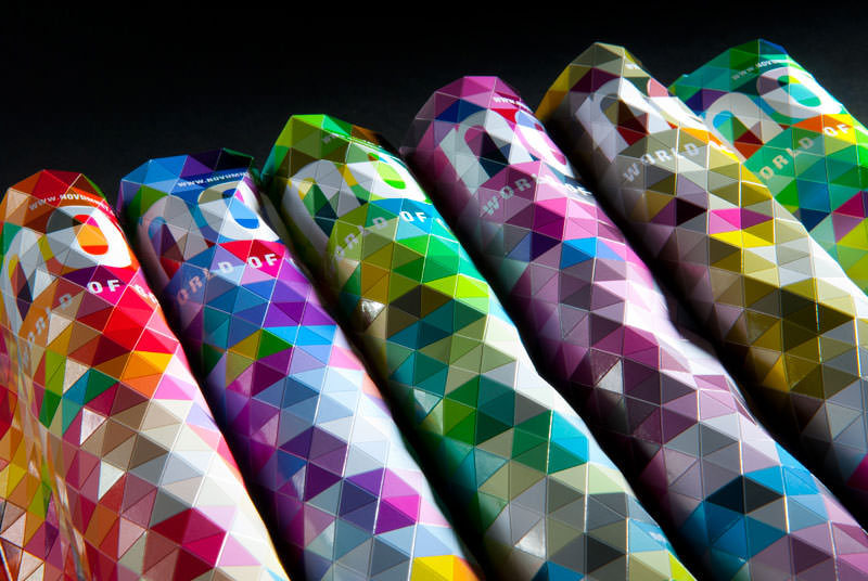
Novum 11/11 – Making Of Cover <<<<< Link to Video
An amazing piece of design and printing produced this complex edition of "Novum". The video above is a step by step method of how they produced the edition and is literally what we have just been learning about so found it useful been applied to something. They got the effect by die-cutting into the cover in 3 different directions to give it the marbled and flexible effect.

Monday, 10 October 2011

Stock Options and Printing Methods


La Sal Gallery sells gourmet products so this needs to be shown through its products. the business card is stunning it has been done by using spot UV Varnish on the lettering and the symbol. the grey on black look sophisticated and expensive so relating to the products extremely well.


Here they have printed onto glass which is an interesting stock.


The Business cards produced here are metal which has been power-coated. the paper parts have been done by using both offset and letterpress printing. 


Print finishes and Stock


Antao Progetti
An interesting stock has been used here which is everyday grey box which has been Die cut. the Thickness of the card emphasizes the die cut and makes it more impressive and stands out.
very original and innovative stock and printing method to go with it.


Below ia an attractive business card with has been de-bossed, spot colour and UV varnished. they printing methods have payed off on this and it has turned out looking stunning.


Wednesday, 5 October 2011

Stock Options and Printing Methods

Packaging and Promotion


a very nice de-bossed business card above using 2 colours of card with a grainy finish one side and a smooth on the other.


Jose Guizar
these are some very interesting labels for the bottled beer by Jose Guizar. 2 spot colours used on each and they also have a metallic foil as one of the colours on each.

Stock options and Print finishes


Branding and Identity

Fame
Here they have used a selection of printing techniques from screen printing the gold onto the cups. Deboss and gold foil the luxurious coasters and the same on the gold cover finish matchbox.
Not necessarily my style but the techniques are performed to perfection and the crisp and luxurious finish give it a head against competition.


TAble No.1
Table No.1 has produced a effective yet extremely simple method of printing on the majority of the products used. They have used a rubber stamp on which they have used on their menus and checks. this means its easy to replace as you don't need to contact printers just stamp some more products. 


Business CardsThese business card designs by Jordan Metcalf are had cut think mount card then screen printed silver. 


Monday, 3 October 2011

Colour for Print

BERG

A Lovely Dunotone design here for the company Alpha.

Colour in Print


Insite

Packaging and Promotion


this is a monochrome print only using shades of grey.

SI Exclusive: StudioMakgill

Manual: Hi Res Images
Spot colour is used here with the orange colour in contrast with the grey wording and the white stock.


CMYK print for the vinyl cover. the colours in this are tonally green but cmyk must have been used to create these colours.   

Colour in Print

Branding and Identity


CMYK is used for the colourful ray ban branding campaign.


SI Special   Mode x DaMa: Part 2
Monochrome image only using shades of magenta.

Manual Creative: High res Special
CMYK logo using a spectrum of colours here.