
Saturday, 10 December 2011
Inglorious Bastards Kinetic Tpye
Inglorious Basterds Kinetic Type from aki chang on Vimeo.
simple animation for the film inglorious bastards
Dubstep Typography Tutorial
Dubstep Tutorial from Nate Londa on Vimeo.
A cleaver video about making a Dubstep tune. very cleaver as the type is used is a way to compliment the music and speakning over it.
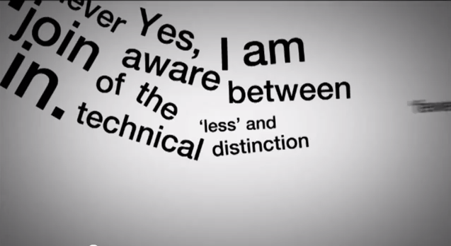
kinetic Type
Digital Design (Spring 2011)
Oklahoma State University
Professor Justen Renyer
Illustrator, Soundbooth, Cinema 4D, After Effects
This Kinetic Typography project was created from the dialogue of Conan O'Brien's final episode of The Tonight Show on NBC. In this farewell address, he describes his feelings towards NBC and the situation at hand. His personality exudes positivity and humor allowing this dialogue to describe his character very well. Even through the hardships of leaving NBC he promotes hard work and kindness.
The concept behind this video is to show Conan O'Brien as a the monumental entertainer and solid wall that he is. Conan O'Brien is and will continue to be a seasoned television entertainer. After drawing inspiration from Lou Dorfsman's Gastrotypographicalassemblage, this concept was achieved by creating a literal wall from over 60 individual typographic layouts. These custom crafted layouts reference a variety of eclectic type design. The combination of eclectic typography and modern 3D letter forms achieved in Cinema 4D provides a contrast between old and new. This contrast emphasizes time to create a sturdy and timeless object. This solidity and timelessness is the perfect representation of Conan O'Brien.
Conan O'Brien Kinetic Typography from Jacob Gilbreath on Vimeo.
Thursday, 8 December 2011
Pixar Animation
Dispite the only using a gradient on the background you get a scene on a 3D space. Also a slight showdow at the bottom of the letters also help on add to the 3D effect.
Monday, 5 December 2011
Friday, 2 December 2011
Great Animation by Sebastian Baptista, a Motion Designer from Uruguay (based in England).
Make it better from Sebastianbap on Vimeo.
Make it better from Sebastianbap on Vimeo.
Inlingua from jvdemari on Vimeo.
The German agency OPTIX Digital Pictures has created a text war for Inlingua business english. “Only where handle the English language, survived the word war.” I die every day ;)
Inlingua from jvdemari on Vimeo.
The German agency OPTIX Digital Pictures has created a text war for Inlingua business english. “Only where handle the English language, survived the word war.” I die every day ;)
An infographic dissecting the nature and ramifications of Stuxnet, the first weapon made entirely out of code. This was produced for Australian TV program HungryBeast on Australia's ABC1
Direction and Motion Graphics: Patrick Clair patrickclair.com
Written by: Scott Mitchell
Stuxnet: Anatomy of a Computer Virus from Patrick Clair on Vimeo.


Tuesday, 22 November 2011


Julien Hauchecorne two subtle duplexed uncoated smooth paper manufactured by GFSmith to reach 700 gsm and both cards have a deep debossed monogram logo on the front side. The 500 cards are printed on the backside with a diffraction effect foil on a pristine white and ebony black duplexed substrate with a diffraction foil fore-edge printing process on the outside edges.


Monday, 21 November 2011

Minimal Design

Here is some packaging for a grow your own plant. nice simple minimal design. Again using capitals in the logo but still having a calming affect.
What is good

A simple medical packaging. the great deal of white space with the odd bit of green just scream out health benefits i will hopefully portray that im my work also.
What is good

I found this packaging series and the colours used are very similar to the ones i have chosen for my 3 series. i am happy about this as i can see here they work well together.
What is Good
just some simple minimal designs using a big amount of white space and visually appealing.


Saturday, 19 November 2011
Tuesday, 1 November 2011
Stock Options


these organic food is made with recycled paper and is designed to be DIY as it would be sold in markets so the fronts and back are changeable.
It's a nice idea and it definitely works as a set but i would like to know if is productive and necessary to have DIY packaging.
Very Flawless Packaging


Here i enjoy the flawlessness of the packaging models. it is so so crisp and just made beautifully. This gives the sense of professionalism and adds value to there products no doubt. i hope to achieve this effect to an extent. it just looks so bloody good.
Stock Options


an arrange of differnt brown stocks where they have used a stamp as there only printing method. i like it when theis is done it means that the logo and slogan need to be perfect and do all the talking for the brand. simple cheap and you get a slightly different finish with the each stock which works beautifully.
Stock options and Printing Methods


 A Lovely publication here using a Hardcover with a linen back. I suspect that the printing on the front could be a foil or litho printed. it has a nice natural feel. the subtel colours work well together and the layout of the book is much to be admired.
 Monday, 31 October 2011


- Packaging design for the complete line of products Suavipiel. The aim was to get a line of bath products differentiated from other brands, with a low production cost. The choice was a purely typographic design, clean and clear, which uses the name of different families as a main chart.
- Diseño de packaging para la línea completa de productos Suavipiel. El objetivo era conseguir una línea de productos para baño diferenciada de otras marcas, con un coste de producción bajo. Se optó por un diseño exclusivamente tipográfico y claro, en el que se utiliza el nombre de las diferentes familias como elemento gráfico principal.


Heydays
Our very own profile. Only one typeface is used in limited sizes. The shiny chrome is an interpretation of our name — Heydays. The use of cardboard is in contrast to this, it is for function and everyday use. The use of function is further elaborated in the heavy use of custom tape. Print finishing includes blind emboss, mirrorboard, cardboard and silkscreened jewelcases.
Stock Options and Printing Methods


A poster series which have all been Silk-screened. the Overprinting of the colours give an attractive blend of colours which work well together and with the grey stock. They are aimed for a design related audience and they definitely appeal to them.
Stock Option and Printing Methods


Some very nice and simple Identity prints here. Using black foil on black stock looks next level fresh. simple and attractive design i hope to use this technique in the future. but for my current project i don't think black on black would be the way to go.
Stock options and printing methods


Here are some very attractive prints designed for Cream PR. the printing method used is foil blocking which is has given a slight de-boss. The stock used is a nice thick off white which brings out the bright foiling very nicely. i really like this and the foils are to in your face like i am used to seeing the matte colours almost look screen printed.
Stock Option and Printing Methods.


Simple and affective packaging range and brand identity fot kitchen company "Falcon". the whole range screams Traditional retro which suits the products very well. A birds eye view of the product as a boarder on the top of the box. the printing methods looks as though it has been screen printed due to the matte and crisp white effect.
Design For Print Stock Considerations


A stunning piece of design here which has been C-typed print for the info graph in the centre while the rest is screen printed in a matte white, the whole thing is done on Fujiflex pastic. Never really seen anything like this and is a nice piece of innotative print. It is a graph o show empires, colonies and also territorial occupations from the year 2334 BCE to the present.
Subscribe to:
Posts (Atom)